NHL: Breakaway Design System
A scalable, Figma-based system built for the whole organization.
Problem
When the NHL's contract with Disney Streaming Services ended, and NHL.com and the mobile apps came back in-house, we had no official design system to build on. To launch the new Dot Com, we had to start from the bottom up and build our components from scratch, at the same time we were already in the middle of the DeltaTre migration. Rather than designing every page independently and hoping things lined up later, the team recognized early that we needed a shared foundation that could hold up across NHL.com, the mobile apps, and our other digital products, not just one page at a time.
Approach
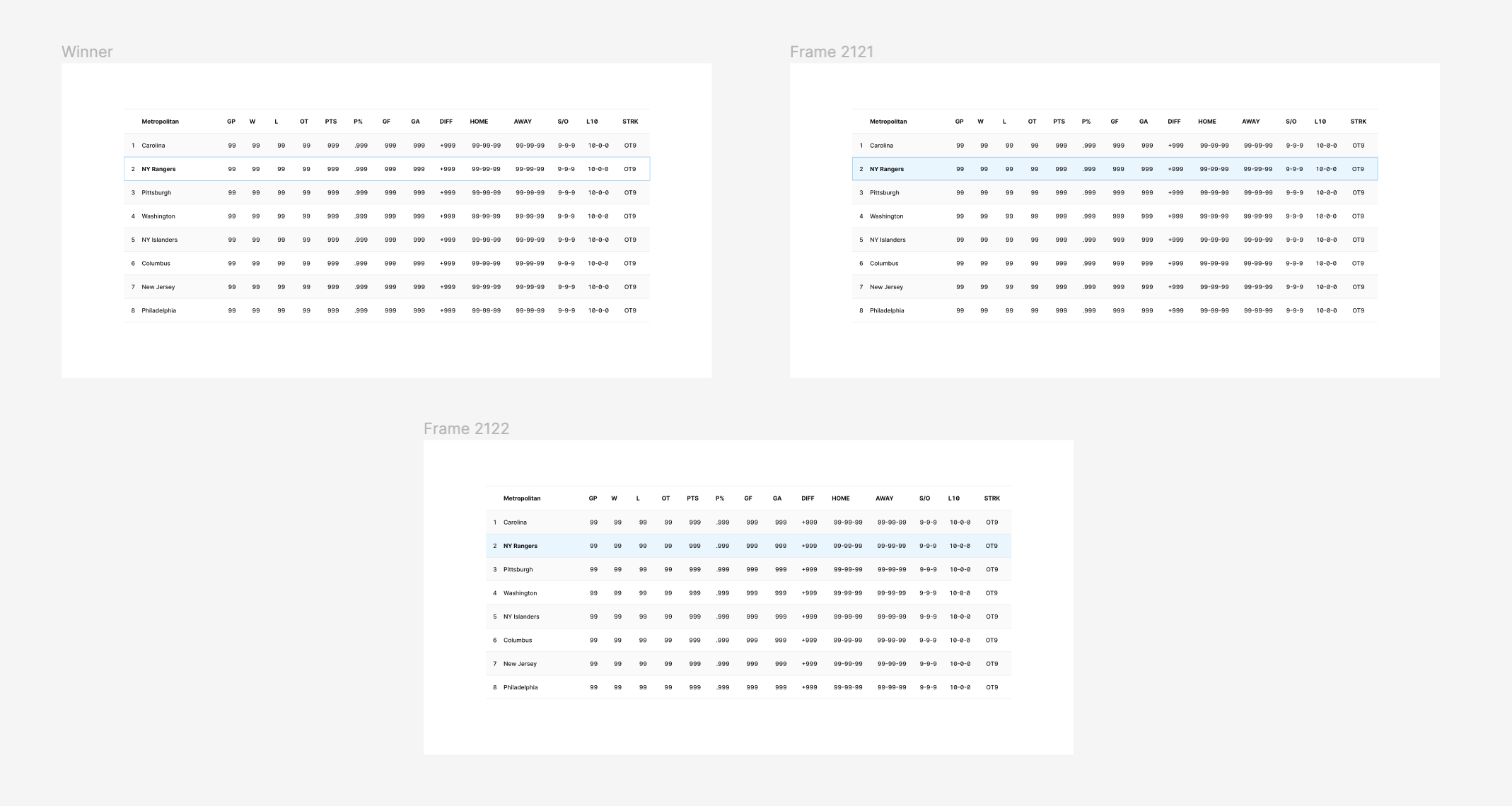
Most of the design team, myself included, contributed directly to building that foundation while still owning our own individual product areas. We started with the fundamentals: color and typography tokens, then patterns for both light and dark mode. Given my background with data-heavy pages, I dove straight into cell and table styles, along with some of our first dropdowns, buttons, and other common UI elements, all built to keep things consistent across our digital platforms rather than reinventing the wheel on every page. As patterns got established, we added them into our shared Figma libraries so any designer could reuse them instead of quietly creating their own one-off version of the same thing.
Challenges
The core challenge was that we were building the design system while actively using it. There was no dedicated design systems team laying down rules ahead of time, so designers had to balance shipping their assigned NHL.com pages against building the very components and standards those pages needed to exist first. A lot of the time, we were discovering design system gaps in real time, in the middle of migration work, not in some separate planning phase beforehand.
Consistency across platforms added another layer. A component couldn't just work for the page in front of us. It had to scale across NHL.com, the mobile apps, different screen sizes, and both light and dark modes, which meant constant collaboration across the design team just to agree on shared patterns instead of everyone quietly solving the same problem slightly differently.
Mockups
Early work included explorations across cell types, table styles for both light and dark mode, and foundational components like dropdowns and buttons, each one built to hold up across contexts rather than a single page.
Cell Types:
Table Explorations:
Components:
Conclusion
The design system is still evolving, and there still isn't a dedicated design systems team. Ownership is distributed across the whole product design team instead. When someone spots a missing component, a new use case, or a chance to improve an existing pattern, they contribute that update back into the shared library. It's let the system grow organically alongside our actual products, building a steadily more consistent foundation for whatever comes next, rather than waiting for a perfect system to exist before building anything real on top of it.